
Wall Art Under $200 That Looks Expensive
A bare wall isn't a neutral choice — it's a missed one. Wall art is the element that gives a room its point of view, anchors the furniture beneath it, and tells anyone walking in that someone actually lives here with intention. The problem most people run into isn't budget. It's knowing what to look for, how to size it, and how to hang it so it looks like it belongs.
This guide covers exactly that: how to find wall art that looks expensive without spending like it, how to hang it correctly, and how to build gallery walls that look curated instead of chaotic.
Why Most Wall Art Falls Flat
Before getting into what works, it helps to understand the three most common wall art mistakes — because any one of them can undercut even a genuinely beautiful piece.
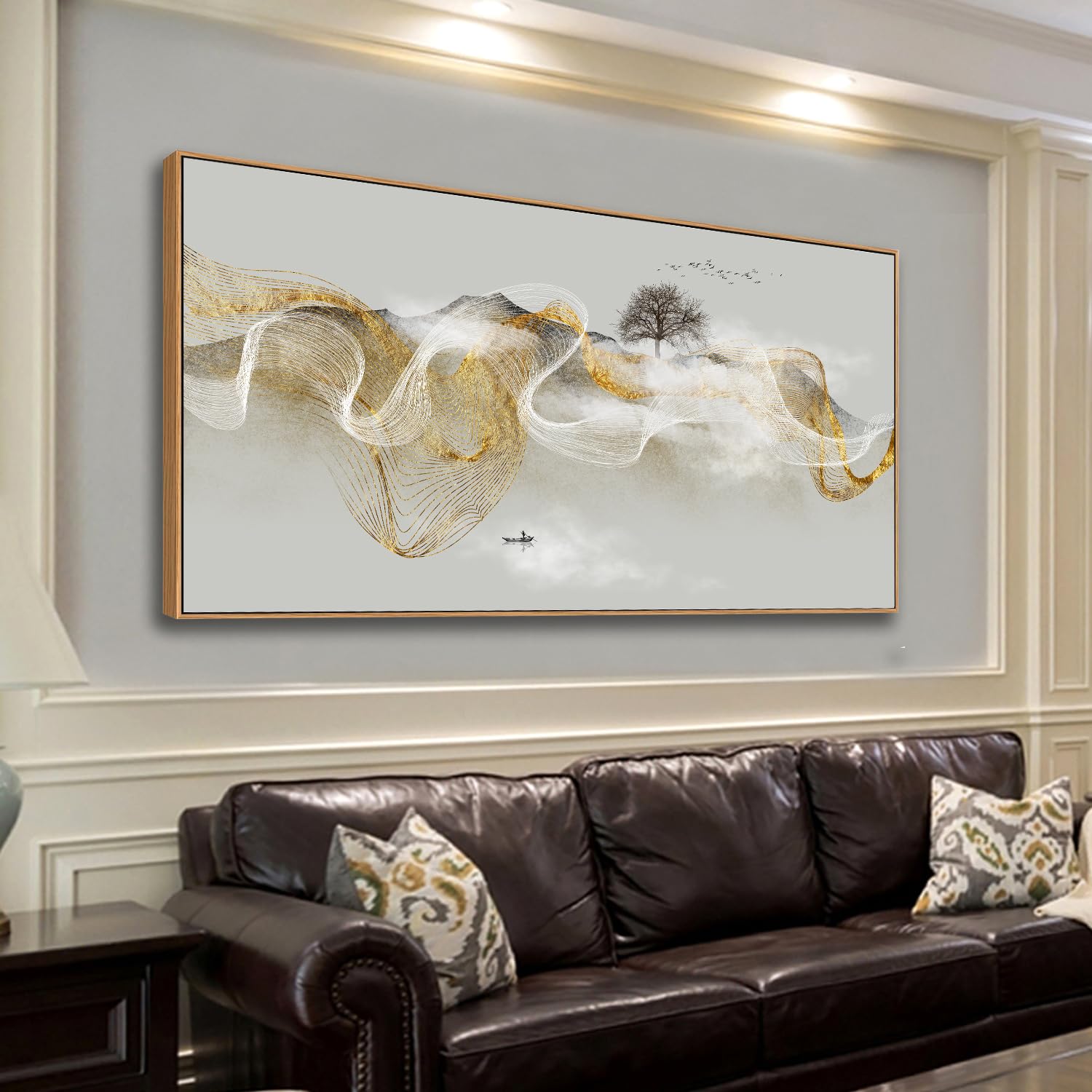
• Wrong size. The most frequent mistake by far. A small piece on a large wall looks lost and makes the room feel unfinished. When in doubt, go bigger than feels comfortable.
• Wrong height. Art hung too high is the second most common error. The standard rule — center the piece at 57 to 60 inches from the floor — exists because that's average eye level. Most people hang art 6 to 12 inches too high.
• Wrong relationship to the furniture. Wall art needs to anchor to something below it. A piece floating above a sofa with no visual connection to the room's furniture reads as an afterthought, not a design choice.
Fix those three things and the art you already own will look better immediately.
What Actually Makes Wall Art Look Expensive
Price and quality don't always correlate in wall art. What does correlate is a handful of specific characteristics that signal quality to the eye — whether or not the piece cost $50 or $500.
• Scale. Large pieces almost always read as more expensive than small ones, regardless of cost. A single 36" x 48" print will anchor a room more effectively than four 8" x 10" pieces at the same total price.
• Framing. A simple, well-made frame transforms a print that costs nothing into something that looks gallery-worthy. Thin metal frames, wide linen mats, and natural wood frames all work. Deep plastic frames rarely do.
• Subject matter with restraint. Abstract work, botanical prints, architectural photography, and minimal line art tend to hold up over time and across interior styles. Trendy or overly literal subject matter dates quickly.
• Matte finish. Glossy prints under glass pick up glare and look commercial. Matte or luster finishes — or prints behind non-glare glass — read as more refined.
• Negative space in the composition. Art with breathing room in the image itself tends to feel more considered than art that fills the frame edge to edge. A minimal composition hung with adequate wall space around it projects confidence.
|
Where to Find Quality Art on a Tight Budget The best sources for wall art that looks expensive without the price tag: • Print-on-demand platforms: downloadable art files you print locally through a print shop at any size • Estate sales and antique markets: original works and vintage prints at a fraction of gallery prices • Emerging artists on portfolio platforms: original work that appreciates in value, often priced accessibly • Curated home decor retailers: collections that have already been edited for quality and aesthetic coherence In every case, invest the saved budget into a better frame. The frame is where the piece becomes wall-worthy. |
Sizing Wall Art: The Rules Designers Use
Sizing is the element most people get wrong, and it's also the easiest to get right once you know the formula.
• Above a sofa: the art should be roughly 2/3 the width of the sofa. For a standard 84" sofa, that means art between 50" and 60" wide — either a single large piece or a grouping that spans that width.
• Above a bed: art should be equal to or slightly wider than the headboard. Narrower art above a wide headboard looks like an accessory, not a statement.
• On a large open wall: go larger than feels right. Most people's instinct is to choose art that feels appropriately modest on a big wall. Designers go the other direction — one oversized piece fills the wall and anchors the room.
• In a tight space: a vertical format painting or print in a narrow hallway or between two windows will feel proportional where a horizontal piece would fight the architecture.
The Right Hanging Height — Every Time
The rule is consistent across every context: hang art so the center of the piece sits 57 to 60 inches from the floor. This is average eye level and is the standard used by every major gallery and museum. It works in living rooms, bedrooms, hallways, and dining rooms.
The one exception: art hung above furniture. In that case, the gap between the top of the furniture and the bottom of the frame should be 6 to 12 inches — close enough to feel connected, far enough to breathe.
Wall Art Placement by Room: Quick Reference
Here's how sizing, height, and approach change across the most common rooms:
|
Location |
Ideal Size |
Hanging Height |
Best Approach |
|
Above a sofa |
2/3 the sofa's width |
57–60" from floor to center |
Single large piece or horizontal triptych |
|
Above a bed |
Equal to or wider than the headboard |
8–12" above headboard |
One statement piece or diptych |
|
Entryway wall |
Proportional to console below |
57–60" from floor to center |
One bold piece or small gallery |
|
Dining room |
Large enough to anchor the wall |
Eye level when seated |
Single canvas or framed print |
|
Bathroom |
Small to medium — not overwhelming |
57" from floor to center |
One piece, uncluttered |
|
Staircase |
Follow the stair angle, varied sizes |
Consistent spacing (3–4") |
Gallery wall, graduated heights |
How to Build a Gallery Wall That Looks Curated
A gallery wall done well is one of the most personal things a room can have. Done poorly, it looks like a collection of things that needed a home. The difference is in the process.
Step 1: Establish a unifying element.
Every successful gallery wall has at least one thing in common across all the pieces — frame color, frame style, subject matter, color palette, or some combination. Without that thread, the wall reads as chaotic.
Step 2: Lay it out on the floor first.
Before a single nail goes in, arrange all the pieces on the floor in the shape of the wall space. Adjust until the grouping feels balanced — not symmetrical, but visually stable.
Step 3: Start from the center, work outward.
Hang the anchor piece — the largest or most visually dominant — first, centered in the space. Build the grouping outward from there, maintaining 2 to 3 inches of space between frames.
Step 4: Mix sizes intentionally.
A gallery wall of all same-sized frames reads as institutional. Vary the sizes — anchor with one or two larger pieces, fill with medium and small — and the wall reads as collected rather than manufactured.
|
The Paper Template Method Before hanging anything, trace each frame onto kraft paper and cut out the templates. Tape them to the wall with painter's tape to preview the exact layout — no holes, no guessing. Adjust until it's right, then use the paper templates to mark nail placement precisely. This method takes 20 minutes and saves hours of patching and repainting. |
One Large Piece vs. a Gallery Wall: How to Decide
Both approaches work. The decision comes down to the room and what it needs.
• Choose one large piece when: the room has a clear focal point (sofa wall, above a bed, above a fireplace), the aesthetic is minimal or modern, or you want the room to feel calm and resolved.
• Choose a gallery wall when: the space is large and needs to be filled with visual interest, the aesthetic is eclectic or personal, or you want the wall to tell a story that evolves over time.
Neither is wrong. What's wrong is small art on a large wall, or a gallery wall without a unifying logic. Start with the wall, not the art.
The Finishing Touch Most People Skip
Wall art doesn't exist in isolation. The furniture beneath it, the lighting near it, and the decorative objects around it all affect how the art reads in the room. A picture light or directed lamp aimed at the piece gives it a gallery quality that overhead lighting never will. A console table with a thoughtful arrangement below a large print makes the art feel anchored rather than floating.
At S.W. Home, every piece in the home decor collection is selected to work within a complete room — not just to fill a wall. Browse the collection to find wall decor and decorative objects that bring a room's point of view together.
|
Wall Decor Worth Looking At Every Day The S.W. Home collection includes wall decor and decorative objects hand-picked to anchor a room, not just fill a wall. Browse pieces that bring a point of view — and the kind of quality that holds up over time. |