

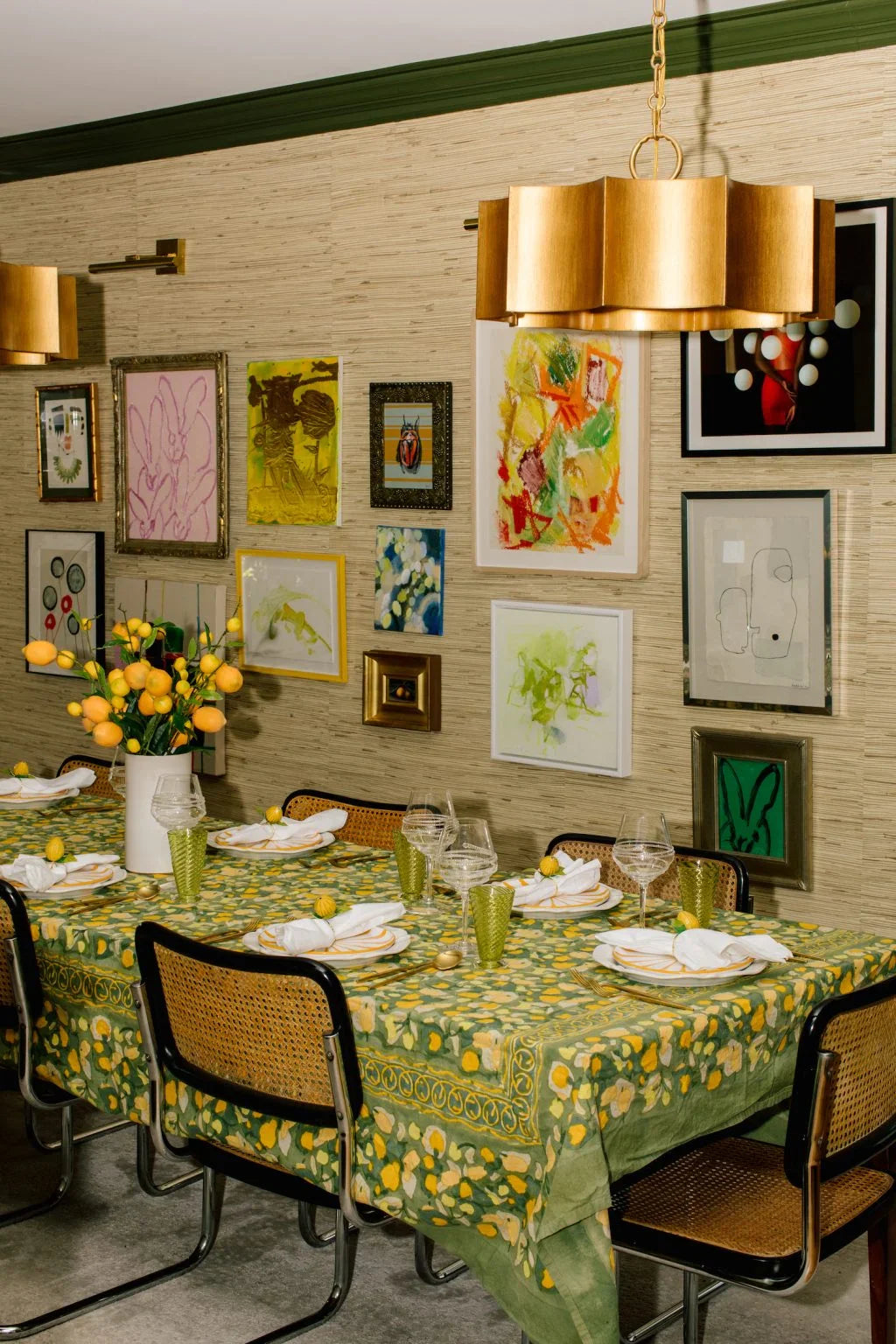
Home Wall Art: How to Build a Gallery Wall That Doesn't Look Messy
A gallery wall done well is one of the most personal things a room can have — a collection of images, objects, and frames that tells a story no single piece could carry alone. Done poorly, it looks like everything you couldn't find another place for. The difference between the two is process: a gallery wall that looks organic and curated is the result of deliberate decisions made in a specific order, not spontaneous hanging.
This is the complete guide to building a gallery wall — from concept to final nail, including the decisions that most guides skip.

Step 1: Define the Unifying Thread
Before anything goes on the wall, establish the single element that will make the diverse pieces read as a collection rather than a random assortment. The unifying thread can be:
• Frame style: all thin black frames, all natural wood frames, all white frames. This is the most common and most reliable unifier — it creates visual coherence regardless of the diversity of the content inside the frames.
• Subject matter: all botanical prints, all black-and-white photography, all abstract work. Consistency of subject creates thematic coherence even when the frames are mixed.
• Color palette within the art: all pieces share a dominant color — all work that includes warm terracotta tones, or all work in a limited blue-and-white palette. More advanced technique; requires more editing.
• Matting: all pieces have wide white mats inside varied frames. The consistent mat creates visual order within frame diversity.
Choose one unifying thread and commit to it. A gallery wall trying to use two or three simultaneously reads as chaotic.
Step 2: Curate the Content
The content of a gallery wall is what makes it personal. Mix types:
• Framed prints and art: the primary content. Original works, quality prints, vintage botanical lithographs, photography — anything that reads as art.
• Mirrors: a small mirror within a gallery wall bounces light, adds dimension, and breaks the flatness of framed prints. Position it at eye level where the reflection is most useful.
• Three-dimensional objects: a wall-mounted ceramic piece, a woven object, a small sculptural element — these add physical depth to the wall that framed prints can't provide.
• Non-art objects in frames: pressed botanicals, textile fragments, vintage maps, pages from old books — objects that become art through the act of framing them.
Step 3: Plan the Layout on the Floor First
This step is the most important and the most skipped. Lay all the pieces on the floor in the shape of the wall space. Spend time arranging and rearranging until the grouping feels balanced before a single nail goes in.
The principles that produce a balanced layout:
• Start with the largest piece. Place the anchor piece first — the largest or most visually dominant. Everything else arranges around it.
• Maintain consistent spacing throughout. 2 to 3 inches between frames is standard. Consistent spacing (not perfectly uniform, but consistently approximate) is what makes the wall read as intentional.
• Distribute visual weight evenly. Large, dark, or heavy-feeling pieces should be distributed throughout the arrangement — not clustered together on one side.
• Keep the overall shape simple. A roughly rectangular or square outline is the most versatile. Irregular outlines (following a staircase, for example) require more planning but work well in their specific contexts.
|
The Paper Template Method — Non-Negotiable After finalizing the floor layout, trace each frame onto kraft paper and cut out the template. Tape the paper templates to the wall with painter's tape in the exact positions they'll hang. Step back and live with the paper arrangement for 24 to 48 hours before driving a single nail. What looked right on the floor often needs adjustment at wall scale. The paper templates make every adjustment free and easy. When the layout is finalized: mark nail positions on the templates directly, drive the nails through the paper, then peel the paper away. Perfect placement without the patch-and-repaint cycle. |
Step 4: Hanging Height and the 57" Rule
The center of the gallery wall as a whole should sit at 57 to 60 inches from the floor — the same rule that applies to single pieces. The center of the arrangement, not the center of any single piece, should hit that height.
In practice, this means:
• Identify the visual center of the gallery wall arrangement (approximately the center of the overall rectangular outline)
• Ensure that point sits at 57 to 60 inches from the floor
• Hang everything else relative to that center, maintaining the spacing from your floor layout
What to Mix: The Content That Makes a Gallery Wall Personal
|
Content Type |
Visual Contribution |
Proportion in Mix |
Notes |
|
Framed prints / art |
Primary content, most readable |
50–60% of pieces |
The foundation of any gallery wall |
|
Photography (personal) |
Narrative and intimacy |
10–20% of pieces |
Don't over-index — it becomes a photo wall |
|
Mirrors |
Light, depth, dimension |
1–2 pieces maximum |
Avoid positioning to reflect unflattering angles |
|
3D objects |
Physical depth, texture |
1–3 pieces |
Ceramic, woven, or sculptural elements |
|
Text / typography |
Voice and personality |
1 piece maximum |
More than one reads as greeting card aesthetic |
|
Non-art framed objects |
Surprise and personal reference |
1–2 pieces |
Pressed botanicals, vintage maps, textile fragments |
Browse S.W. Home's home decor and wall decor collection for art, decorative objects, and home accessories worth adding to any gallery wall.
|
Shop Wall Decor at S.W. Home Art, decorative objects, and home accessories hand-picked to work in real rooms and real gallery walls. Browse the S.W. Home collection. |
